Why Most HubSpot Dashboards Fail to Drive Decisions
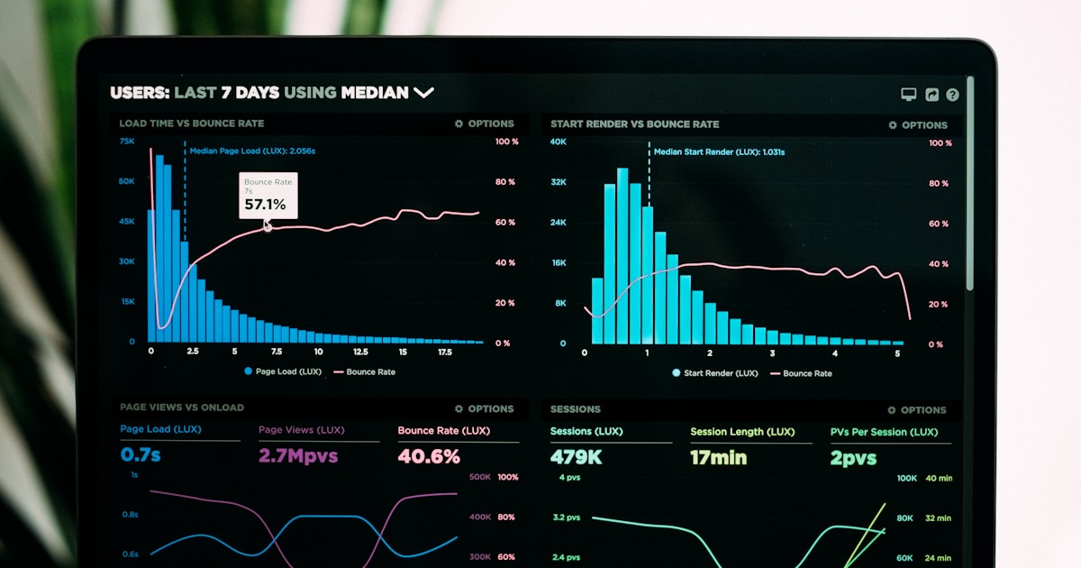
A RevOps director logs into HubSpot every Monday morning. The dashboard shows 47 metrics across 12 widgets. Total contacts. Email open rates. Deal count by stage. Average ticket resolution time. It shows everything – and tells nothing. The director cannot answer the one question that matters: “Are we on track to hit revenue targets this quarter?”
This is the most common HubSpot dashboard problem. Companies build dashboards that display data rather than drive decisions. A good dashboard answers specific questions. A great dashboard makes the next action obvious.
This guide shows how to build HubSpot dashboards for marketing, sales, service, and executive teams that actually change behavior and accelerate revenue.
The Problem: Data Overload Without Decision Context
HubSpot offers 90+ default report types and unlimited custom reports. This flexibility becomes a trap. Teams add reports because they can, not because they should. The result is dashboard sprawl: 15+ dashboards with 200+ reports that nobody uses because finding the relevant insight takes longer than making a phone call to ask.
Three specific problems compound this:
Vanity metrics dominate. Total contacts, email sends, and page views feel good but do not indicate revenue health. Teams track what is easy to measure rather than what matters for decisions.
No hierarchy or context. A dashboard showing “142 MQLs this month” means nothing without context. Is that good? How does it compare to target? To last month? To the same month last year? Without benchmarks and targets, numbers are just numbers.
Cross-team gaps persist. Marketing dashboards show marketing metrics. Sales dashboards show pipeline. Nobody builds the connecting view showing how marketing activity flows into pipeline and revenue. This is exactly the view that executives need.
The Insight: The Three-Layer Dashboard Architecture
Effective HubSpot reporting follows a three-layer architecture. Each layer serves a different audience and decision frequency.
Dashboard Architecture
• Pipeline coverage ratio
• CAC and LTV trends
• Funnel conversion rates
• Updated: Weekly
• Channel/campaign effectiveness
• Pipeline by rep/stage
• Customer health scores
• Updated: Daily
• Today’s tasks and priorities
• Lead queue and response time
• Ticket backlog
• Updated: Real-time
The non-obvious insight: Most companies only build Layer 3 (operational) dashboards because they are easiest to create. However, Layer 1 (executive) dashboards drive the most organizational value because they connect activity to revenue and create accountability across teams. Build executive dashboards first, then work down.
Decision Intelligence: What to Put on Each Dashboard
The hardest dashboard decision is not what to include – it is what to exclude. Every widget added dilutes attention. Follow this rule: each dashboard should answer no more than 5 questions. If it tries to answer more, split it.
Marketing Dashboard (5 Key Questions)
| Question | Report Type | HubSpot Report |
|---|---|---|
| Are we generating enough leads? | New contacts by source (vs target line) | Contacts created, grouped by Original Source |
| Which channels drive quality leads? | MQL rate by channel | Custom: Lifecycle stage change rate by source |
| Is content performing? | Blog/landing page conversion rate | Landing page submission rate + blog CTA clicks |
| Are campaigns generating pipeline? | Campaign-influenced revenue | Attribution report: campaigns to deals |
| How much are we spending per lead? | Cost per MQL by channel | Custom calculation: ad spend / MQLs |
Sales Dashboard (5 Key Questions)
| Question | Report Type | HubSpot Report |
|---|---|---|
| Will we hit revenue target? | Weighted pipeline vs target | Deal forecast report with weighted amount |
| Where are deals getting stuck? | Average days in each stage | Deal stage duration report |
| Which reps need help? | Rep performance vs quota | Closed revenue by owner vs goal |
| Is pipeline growing fast enough? | Pipeline created this month vs target | Deals created, filtered by create date |
| What is our win rate trend? | Win rate over time | Won vs lost deals ratio, trended monthly |
The Solution: How to Build Dashboards in HubSpot
Step 1: Start with questions, not reports
Before opening HubSpot’s dashboard builder, write down the 5 questions each stakeholder needs answered. These questions become your report specifications. If a report does not answer one of these questions, it does not belong on the dashboard.
Step 2: Choose the right report type
HubSpot offers single-object reports (contacts, deals, tickets), cross-object reports (contacts + deals, companies + tickets), and funnel reports (conversion through stages). Cross-object reports are where the real insight lives because they connect activity to outcome.
Step 3: Add targets and context
Every metric needs a benchmark. Use HubSpot’s goal feature to set targets for revenue, deals created, and activity metrics. Reports with goal lines immediately show whether performance is on track or off track – no interpretation needed.
Step 4: Set permissions and access
Not every team should see every dashboard. Sales reps need their personal dashboard plus team performance. Executives need the revenue overview. Marketing needs campaign performance. Set dashboard permissions so each user sees relevant information without distraction.
Step 5: Schedule automated delivery
Configure dashboards to email automatically: executive dashboard every Monday morning, team dashboards daily, and alert dashboards when thresholds are breached.
The Value: What Good Dashboards Deliver
4-6 hours/week
30 min/week
3-5 days
Same day
50-60% accurate
80-90% accurate
Objection Handling: Common Dashboard Concerns
“We do not have enough data yet.” Start dashboards on day one of HubSpot implementation. Even with minimal data, the structure creates accountability. Targets without data create urgency to generate data.
“Our team will not look at dashboards.” Dashboards fail when they require initiative to check. Use automated email delivery, Slack integrations, and mobile app notifications to push insights to people rather than requiring them to pull.
“Custom reports are too complex to build.” HubSpot’s report builder uses a drag-and-drop interface. Most cross-object reports take 10-15 minutes to build. The complexity is in deciding what to measure, not in building the report.
Example: How a RevOps Team Built a Dashboard System in 2 Weeks
A 150-person B2B SaaS company had been on HubSpot for 8 months with no structured dashboards. The RevOps manager inherited 23 scattered dashboards with 180+ reports. Nobody used them.
In 2 weeks, she rebuilt the system using the three-layer architecture. She created one executive dashboard (5 widgets: revenue vs target, pipeline coverage, win rate trend, MQL-to-close conversion, and customer retention). She built three department dashboards (marketing, sales, service) with 5-7 widgets each. She created individual rep dashboards showing personal quota attainment.
The executive dashboard was emailed automatically every Monday at 7 AM. Department dashboards were emailed daily. Individual dashboards were set as team members’ HubSpot home screens.
Within 30 days, the CEO reported “for the first time, I actually understand where we stand without asking anyone.” Sales managers used the deal stage duration report to identify stuck deals weekly. Marketing shifted $40K in ad budget from low-performing channels to high-performing ones based on attribution data they had never previously accessed.
The dashboard rebuild took 40 hours of total effort and generated an estimated $200K in recovered or redirected revenue in the first quarter.
Conclusion
HubSpot dashboards drive decisions when built around specific questions rather than available data. The three-layer architecture – executive, department, and operational – serves different audiences at different frequencies. Each dashboard should answer no more than 5 questions.
Start with the executive dashboard because it creates the accountability framework that makes department and operational dashboards meaningful. Use automated delivery so dashboards push insights to stakeholders rather than requiring them to log in.
The most common mistake is building too many dashboards with too many metrics. The fix is discipline: if a metric does not directly inform a decision or action, remove it.
Need help building dashboards that drive decisions? Work with Widelly to design a reporting architecture that gives every team the visibility they need – without the dashboard sprawl.
Frequently Asked Questions
How many dashboards should a company have?
Most companies need 5-8 dashboards: 1 executive, 1 per department (marketing, sales, service), and individual performance dashboards. More than 15 indicates over-building.
Can HubSpot dashboards replace BI tools like Tableau?
For most mid-market companies, yes. HubSpot reporting covers 80-90% of CRM and revenue reporting needs. BI tools add value only when you need to combine HubSpot data with financial, product usage, or other non-CRM data sources.
How often should dashboards be updated?
HubSpot dashboards update in real-time. The question is how often to review them. Executive: weekly. Department: daily. Operational: real-time or multiple times daily.
The 5 Reports Every RevOps Dashboard Must Include
A RevOps reporting dashboard that covers five areas gives leadership a complete view of pipeline health without requiring separate dashboards for each team. First, pipeline velocity: average deal size x close rate / average sales cycle length = revenue generated per day. This single metric captures the combined effect of deal quality, conversion efficiency, and speed. Second, marketing contribution to pipeline: percentage of active pipeline that originated from marketing-sourced leads versus outbound or partner channels. Third, lead-to-opportunity conversion rate by source: which lead sources convert to qualified opportunities at the highest rate? Fourth, stage-by-stage conversion funnel: where in the sales process are deals stalling or dropping off? Fifth, customer acquisition cost by channel: total marketing and sales spend divided by new customers acquired from each channel.
Frequently Asked Questions
❓ How often should HubSpot dashboards be reviewed?
Different dashboard types have different optimal review cadences. Daily activity dashboards (calls made, emails sent, meetings booked, tasks completed) are reviewed by sales managers every morning to manage daily rep activity and identify performance outliers early. Weekly pipeline dashboards are reviewed in the weekly sales team meeting to discuss deal progression and identify stuck opportunities. Monthly marketing and revenue dashboards are reviewed in the monthly leadership meeting to assess programme performance and budget allocation. Quarterly executive dashboards roll up the full-quarter revenue, pipeline, and cost metrics into the strategic planning review. Building dashboards with the right review cadence in mind prevents dashboard fatigue from tracking the wrong metrics at the wrong frequency.
❓ Can HubSpot dashboards pull data from external sources?
HubSpot’s native dashboards are limited to data that exists within HubSpot. To include data from external sources (Google Analytics, Stripe, Salesforce, data warehouses), companies use one of three approaches. First, HubSpot Operations Hub’s Custom Coded Actions can write data from external APIs into HubSpot custom properties, making external data available in HubSpot reports. Second, native integrations (HubSpot-Google Ads integration, HubSpot-Stripe integration) bring specific third-party data into HubSpot automatically. Third, business intelligence tools (Looker, Tableau, Power BI) connect to HubSpot via API or HubSpot’s direct data connector to create multi-source dashboards that combine HubSpot data with external sources.
About the Author
Mohan raj
Expert contributor at Widelly, sharing insights on B2B and B2C growth strategies.
Related Articles

HubSpot Workflow Automation: 15 Examples That Drive Revenue
Workflows That Actually Drive Revenue HubSpot workflows automate repetitive tasks, nurture leads, and trigger actions…

HubSpot Data Migration Best Practices: Clean, Map, Validate
Data migration into HubSpot is where most implementations go wrong. The process looks simple: export…

Common HubSpot Implementation Mistakes and How to Avoid Them
Why HubSpot Implementations Fail HubSpot is not hard to use. It is hard to implement…